Web Components
last updated at 2023-05-15- <nfdi-navbar>
- <nfdi-footer>
- <nfdi-body>
- <nfdi-sidebar-element>
- <nfdi-sidebar-eleneo>
- <nfdi-header>
- <nfdi-toc>
- <nfdi-code>
The DataPLANT web components were built with the basic Bulma style sheet in mind. It is highly recommended to reference the Bulma style sheet for all projects which use the DataPLANT web components.
Or see here for the official docs.
Nearly all web components come with the possibility to change the default color scheme by applying custom CSS variables to the html document. Each web component comes with a description of available variables and their default values.
If you are using the nfdi-body for documentation it is highly recommended to use the following css snippet to apply a consistent styling to the child elements inside the body.
 v0.8.0
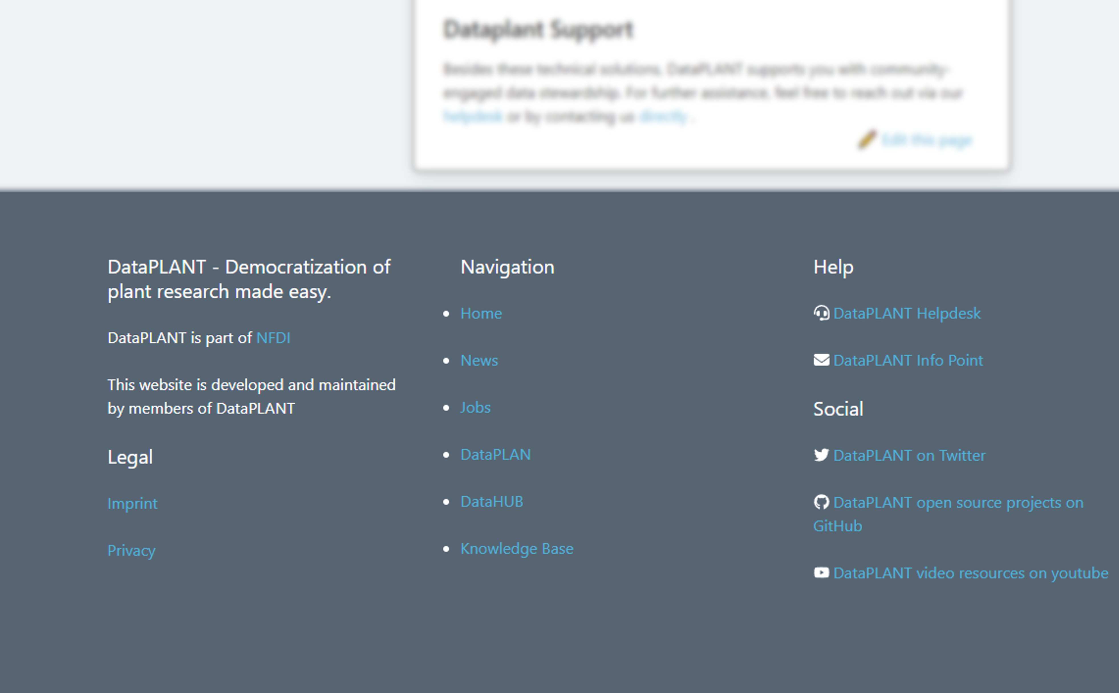
Slotless component with responsive design at 1024px media query. Fixed top and requires padding-top: 3.25rem to be added to html.
--element-background-color, set "background-color" of navbar. (Default: nfdi-darkblue)--element-text-color, set "color", "border-color" and "navbar-divider" color. (Default: nfdi-white)
 v0.8.0
Slotless component.
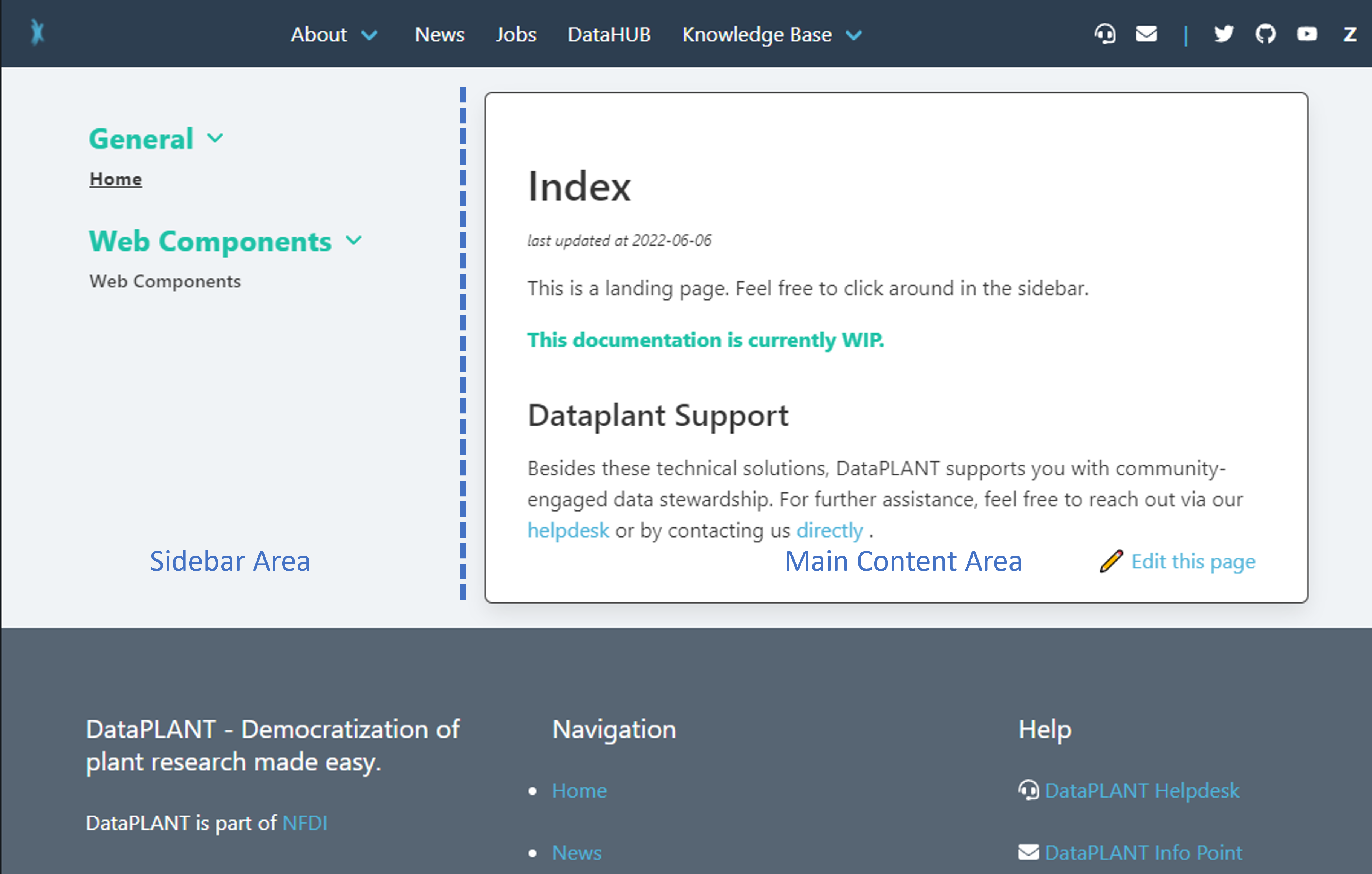
--element-background-color, set "background-color" of footer.(Default: nfdi-darkblue 20% lighter)--element-text-color, set "color", "border-color". (Default: nfdi-white)--link-color, set color of links. (Default: nfdi-lightblue)--link-color, set :hover color of links. (Default: nfdi-black)--header-color, set color to html header elements. (Default: nfdi-white)
The top level container element for the main documentation design.
 v0.5.2
This element will contain all documentation content in its "Main Content Area". To style it's children in this area, use the bulma class class="content".
Features
- Hide sidebar at 1024px media query and show fixed bottom footer to open sidebar area on touch/click.
- Sidebar will slide into view.
Child elements will go to "Main Content Area"
Use this slot to specify an nfdi-sidebar-element.
Use this slot to set an element above all sidebar links.
hasSidebar/hassidebar: set to "true" to display the sidebar. (Default: "false")
--outside-background-color, set "background-color" of are outside of box.(Default: nfdi-olvi 80% lighter)--element-text-color, set "color", "border-color". (Default: nfdi-black)
Stackable element in "Sidebar Area> of body. MUST be slotted in "sidebar" slot of nfdi-body.
Features:
- Can be opened or closed on click.
- Automatically highlights active pages (host + path).
- Automatically hightlights in-page links when scrolled by.
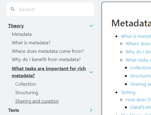
Stackable element in "Sidebar Area" of body. MUST be slotted in "sidebar" slot of nfdi-body.
 v1.0.0
Features:
- Can be opened or closed on click.
- Automatically highlights active pages (host + path).
- Can be nested to increase nesting depth.
Use this slot for the main link.
- MUST be
<a>tag. MUST containhrefattribute. - Will be checked for mathing path to windowlocation to automatically open active subpages.
Use this slot to create a toggable sub-container which contains child links.
- MUST be
<a>or<nfdi-sidebar-eleneo>tag. MUST containhrefattribute. - Will be checked for mathing path to windowlocation to automatically open active subpages.
isActive/isactive: set to "true" to display the element open. (Default: "false")
--accent-text-color, set color of dropdown angle. (Default: nfdi-black)--sidebar-text-color, set text color of all slots. (Default: nfdi-black)--element-background-color, set on hover color for sidebar links (Default: nfdi-darkblue)
v0.5.2
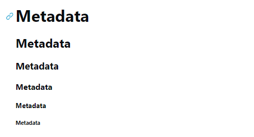
Use with one child element as text. Will propagate html.
Features
- Automaticly creates in-page (/#in-page-link) link before header.
- Automaticly creates id corresponding to in-page link for header.
--link-color: set color of generated in-page link. (Default: nfdi-lightblue)--link-hover-color: set hover color of generated in-page link. (Default: nfdi-black)--header-color: set color to header elements. (Default: nfdi-black)
 v0.5.2
Slotless component to automatically create table of contents.
Features
- Finds all
nfdi-headerinnfdi-body, nests them according to lowest depth and creates<ul>,<li>elements with the in-page links.
Known Issues
- Automatic generation has some major restrictions:
- Only works on elements inside the next lowest nfdi-header level 🐛.
- Example: 'header h2' will be missing.
<script type="text/plain"><nfdi-h2>header h2</nfdi-h2> <nfdi-h1>header h1.1</nfdi-h1> <nfdi-h1>header h1.1</nfdi-h1></script> - Example: 'header h3' will be missing.
<script type="text/plain"><nfdi-h1>header h1.1</nfdi-h1> <nfdi-h2>header h3</nfdi-h2> <nfdi-h1>header h1.2</nfdi-h1> <nfdi-h2>header h2</nfdi-h2></script> - 👀 If you are interested, any help is welcome (here).
--link-color: set color of generated in-page links. (Default: nfdi-lightblue)--link-hover-color: set hover color of generated in-page links. (Default: nfdi-black)--element-text-color: set color to list style elements. (Default: nfdi-black)
 v0.6.0
Example Mermaid Graph (>0.13.0)
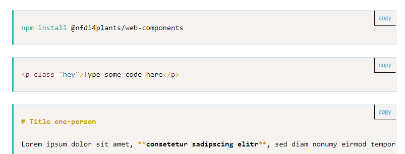
This component can be used to display code snippets similar to <pre> html elements. Any text inside will be presented exactly as written.
Add class="language-*" to the element to specify the language for syntax highlighting.
👀 If you want to showcase html code, it is recommended to add a <script> tag.
Features
- Comes with copy-to-clipboard button.
- Inlcuded line numbers and prismjs syntax highlighting. Supports syntax highlighting for:
markup,html,xml,cssJSON,YAMLfsharp,csharp,clikejavascript,typescriptbashmarkdownpython
- Supports mermaid graphs (>v0.12.0)
--accent-text-color: set the colored border on the left. (Default: nfdi-lightblue)--outside-background-color: set background-color. (Default: nfdi-white)--element-text-color: set copy-button border-color and box-shadow color. (Default: nfdi-white)